Cero Generation
Branding, Print, Digital
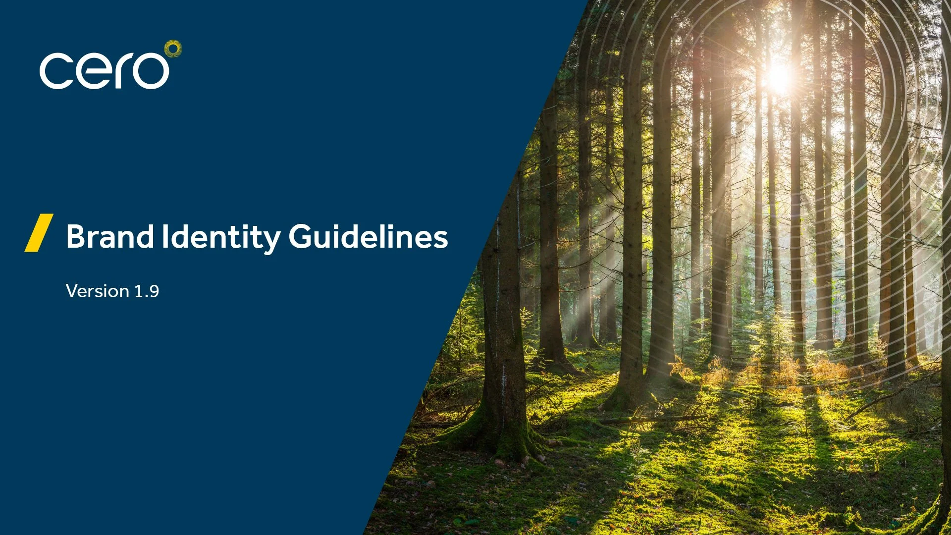
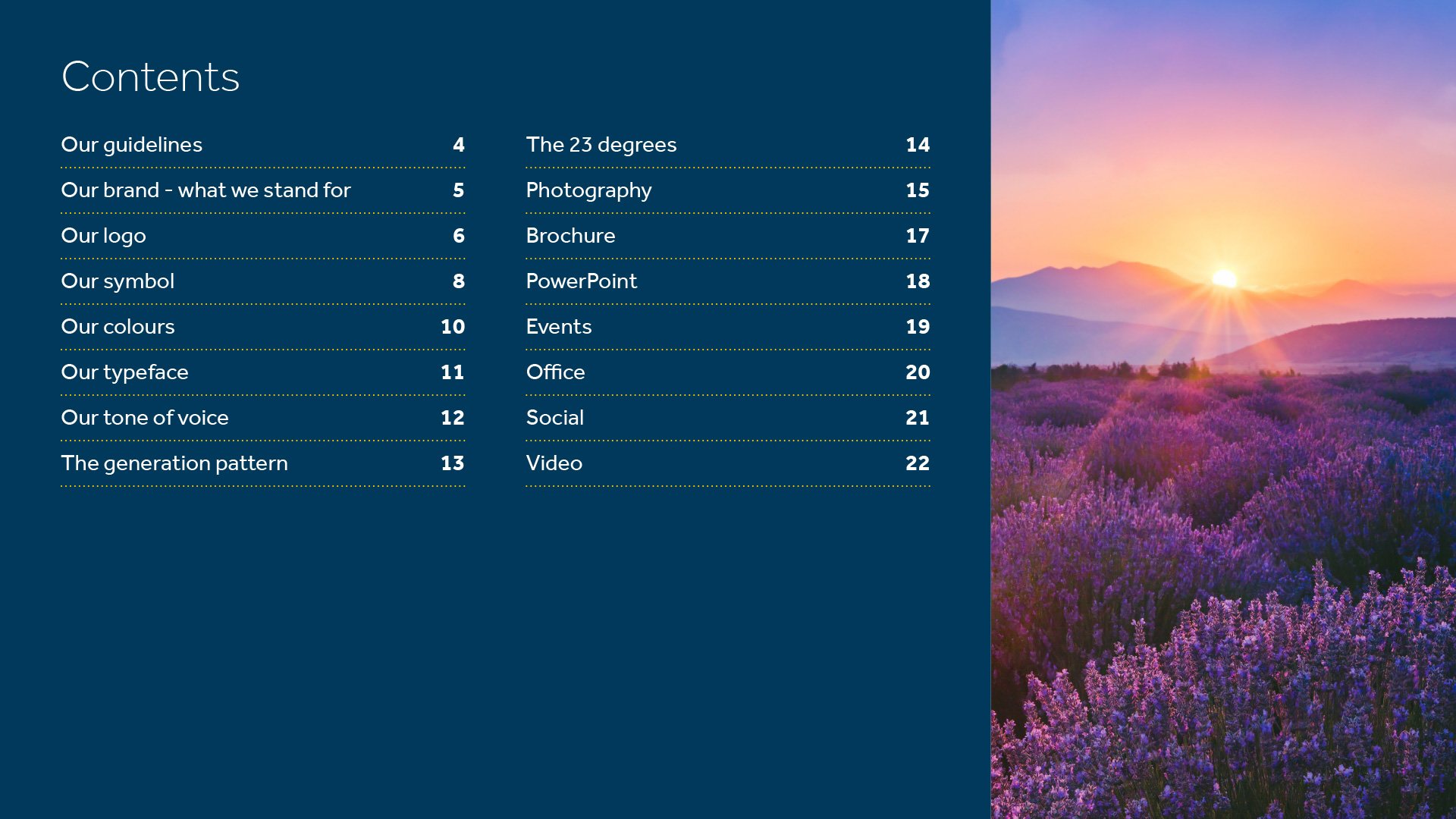
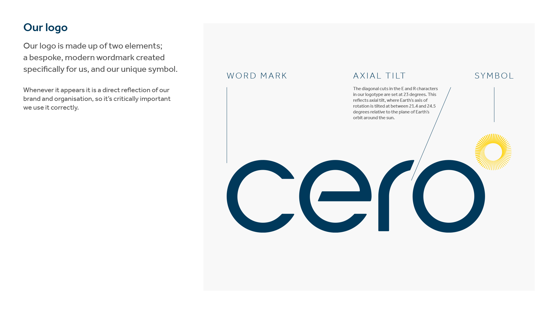
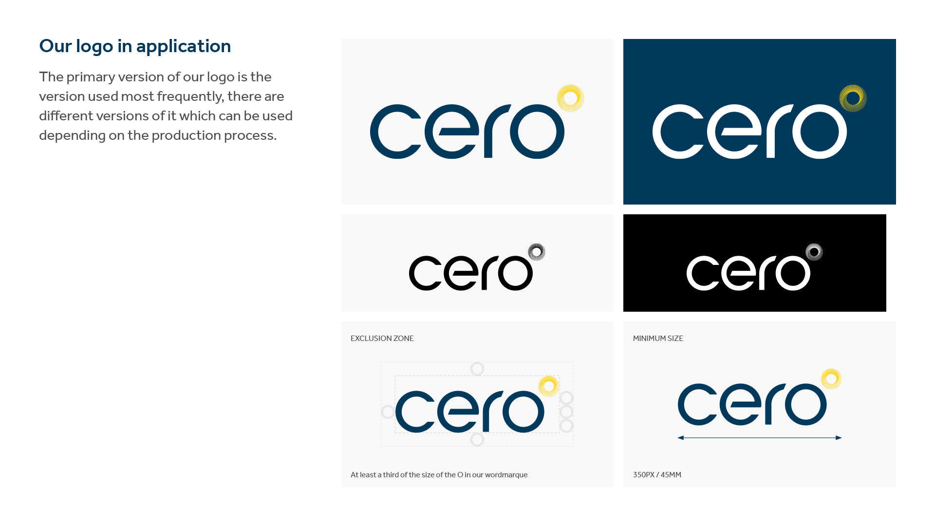
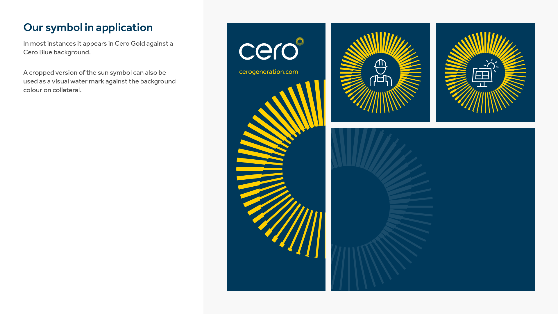
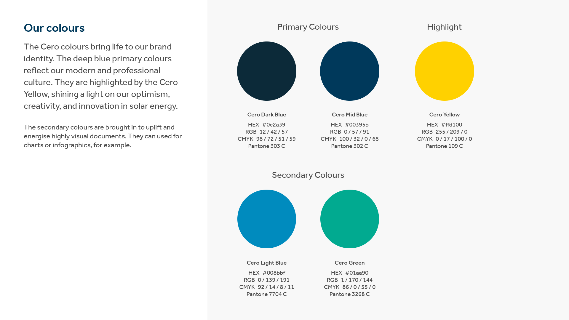
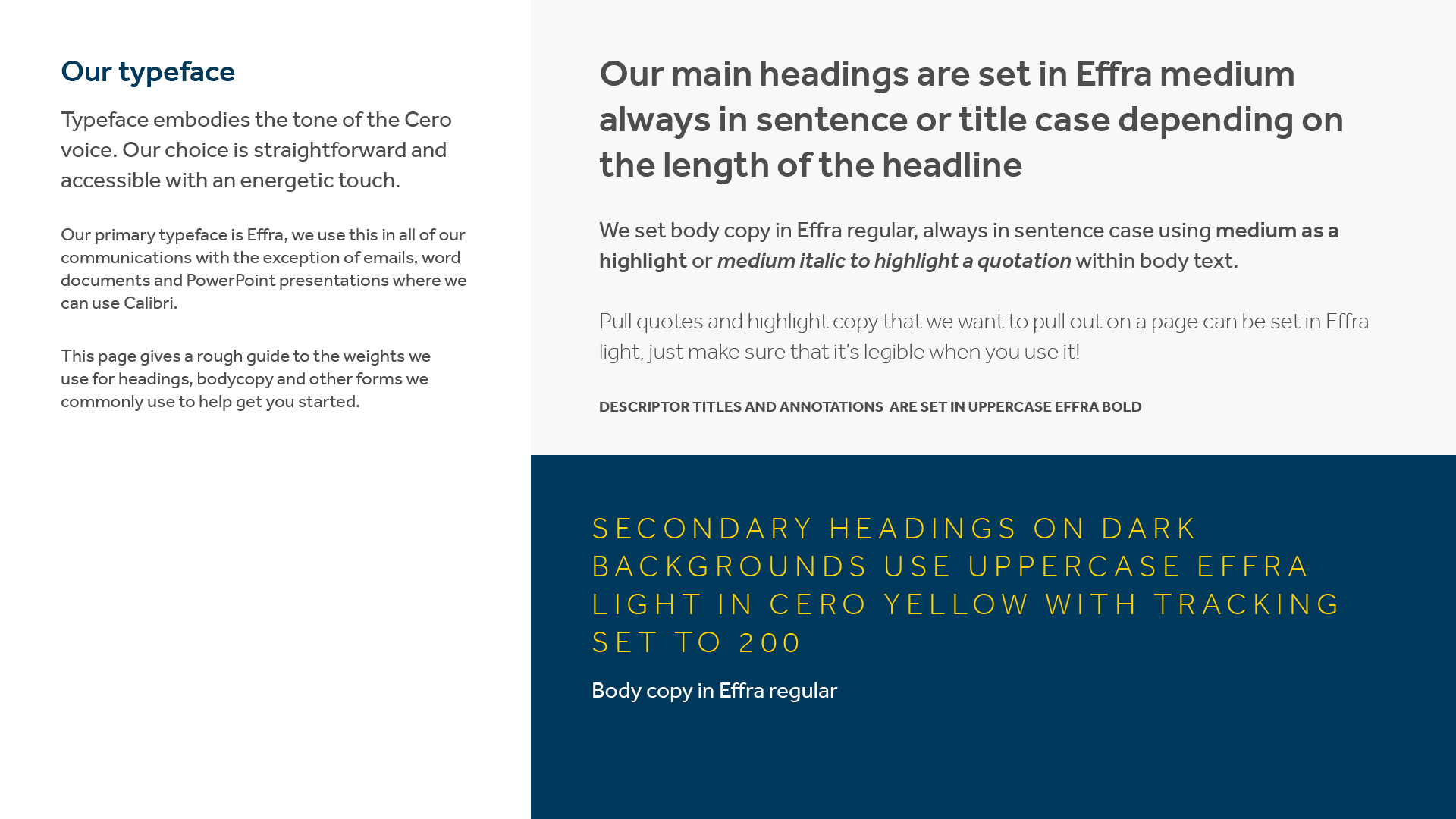
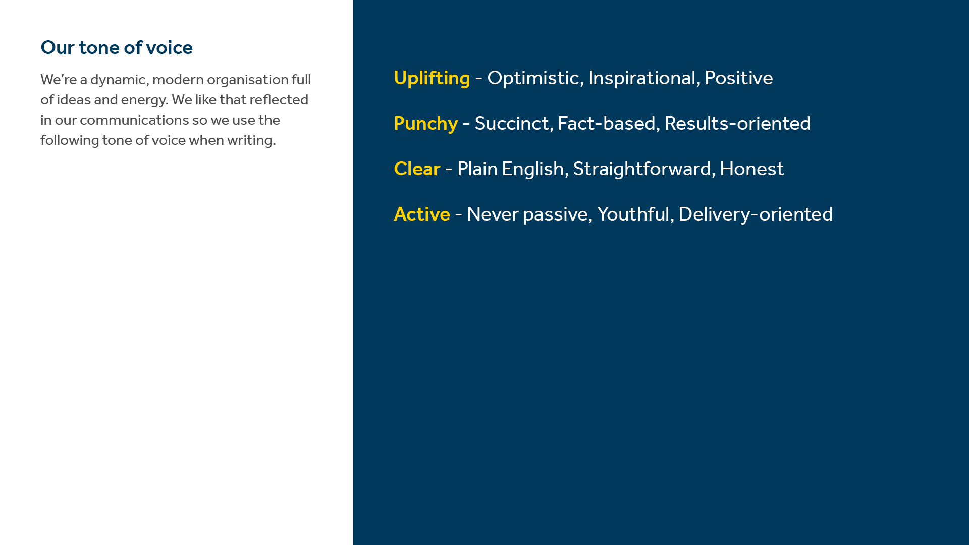
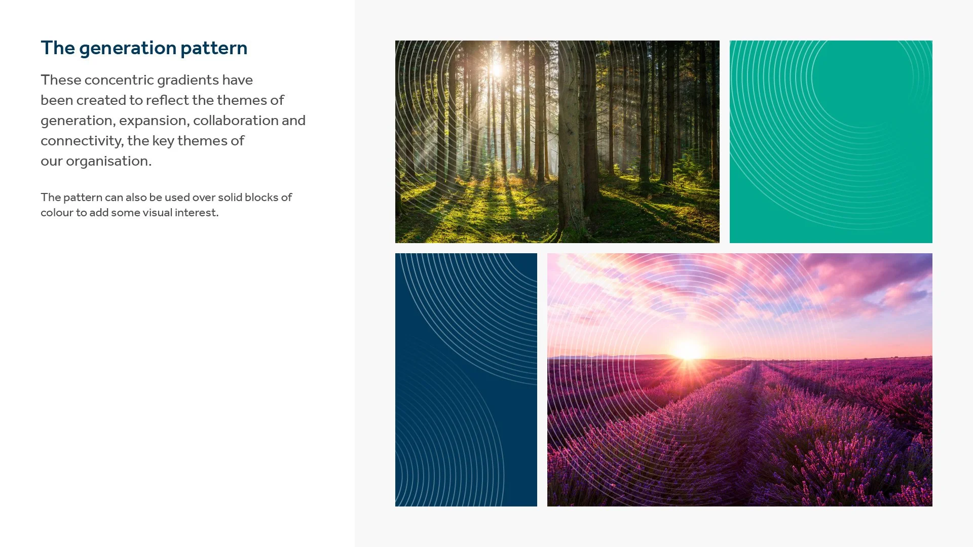
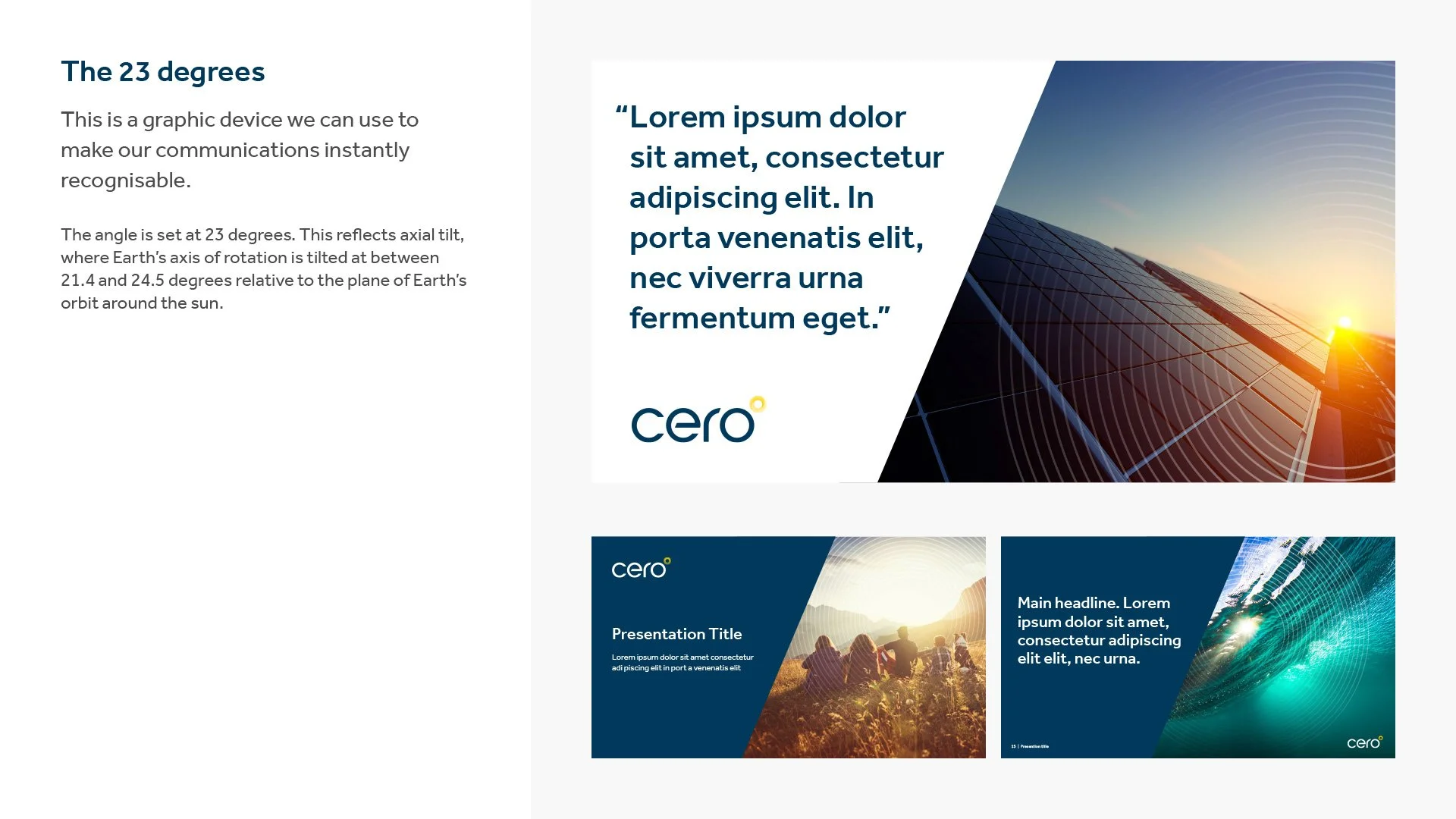
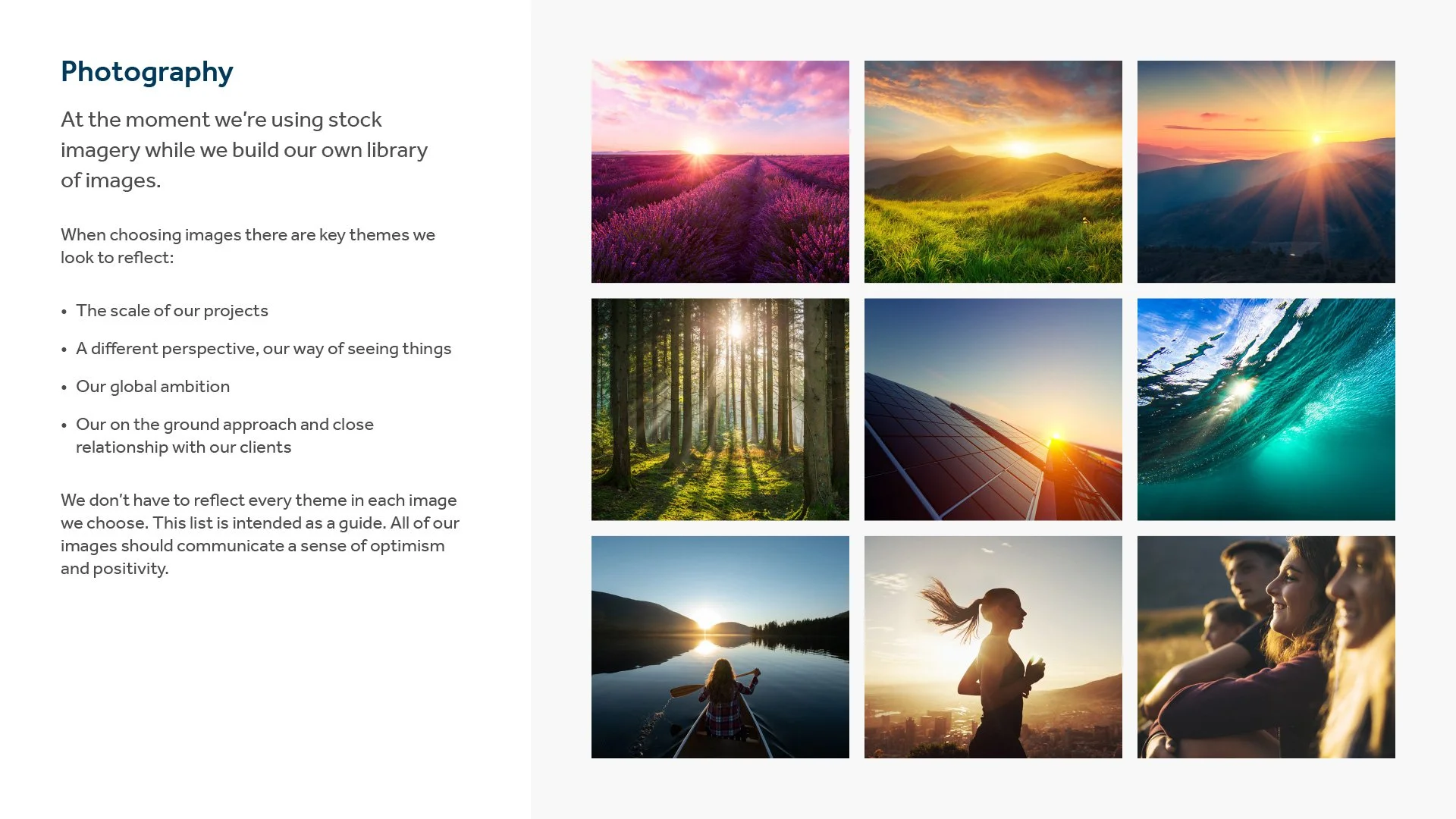
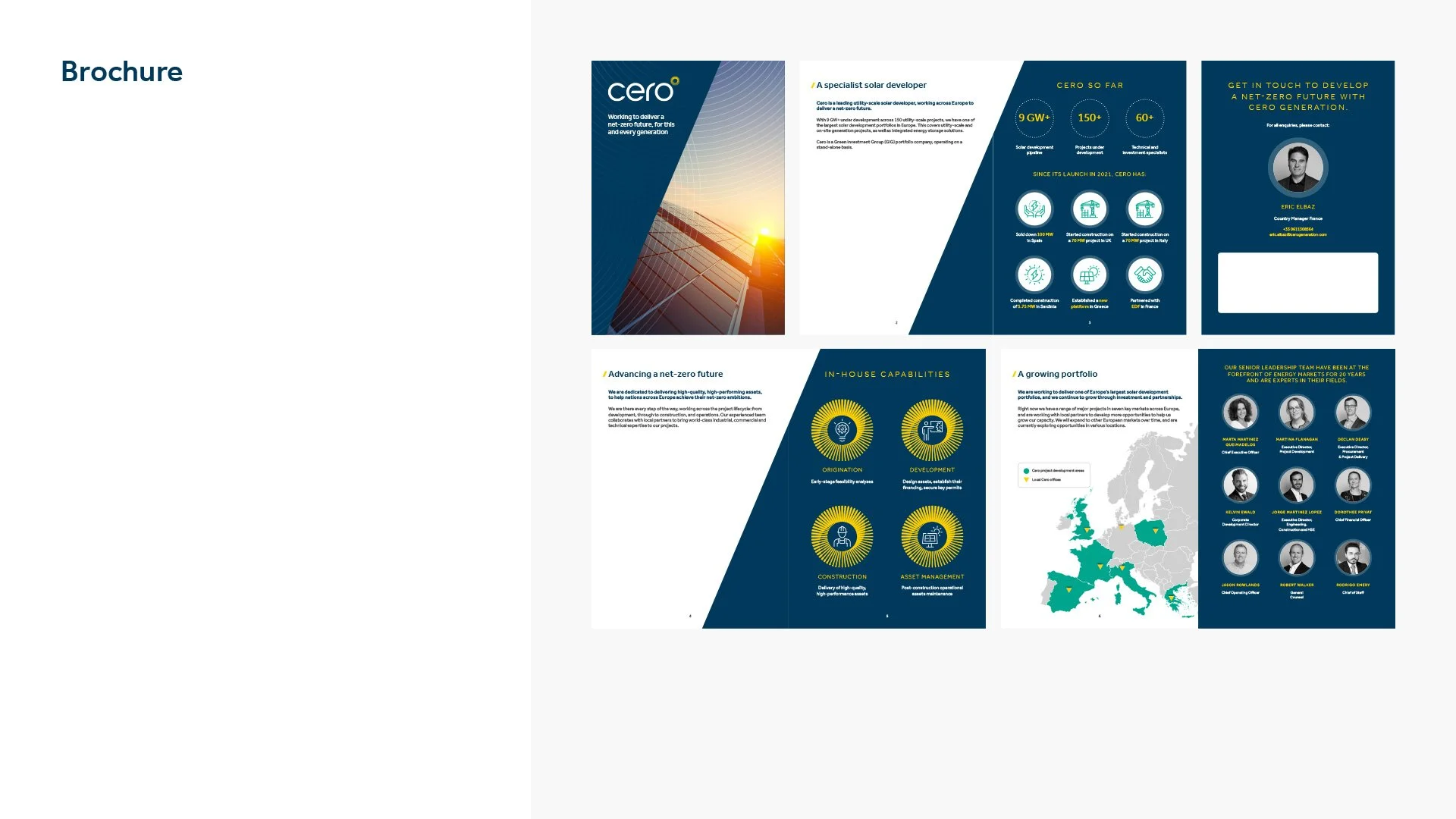
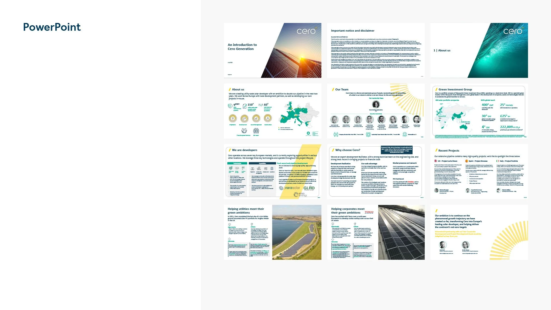
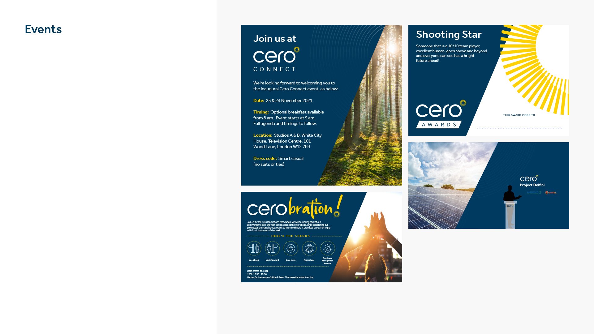
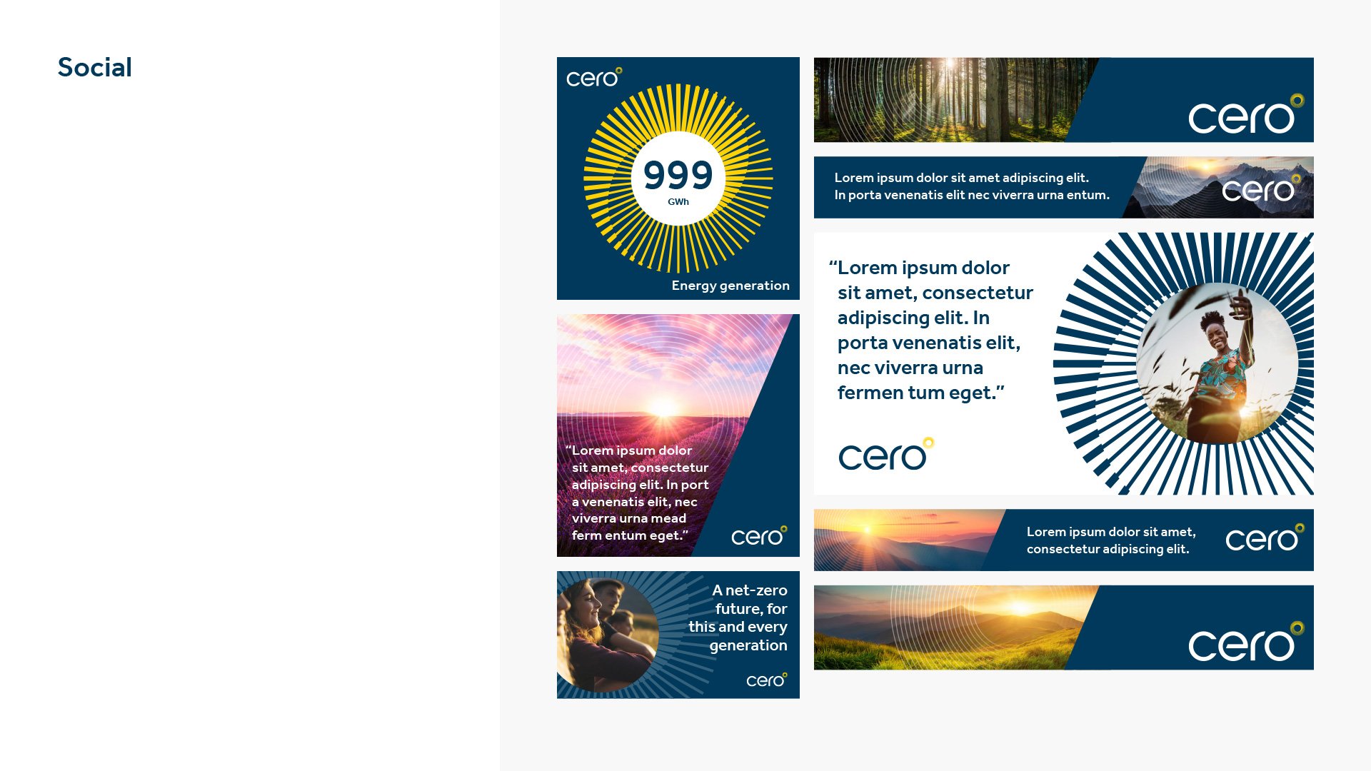
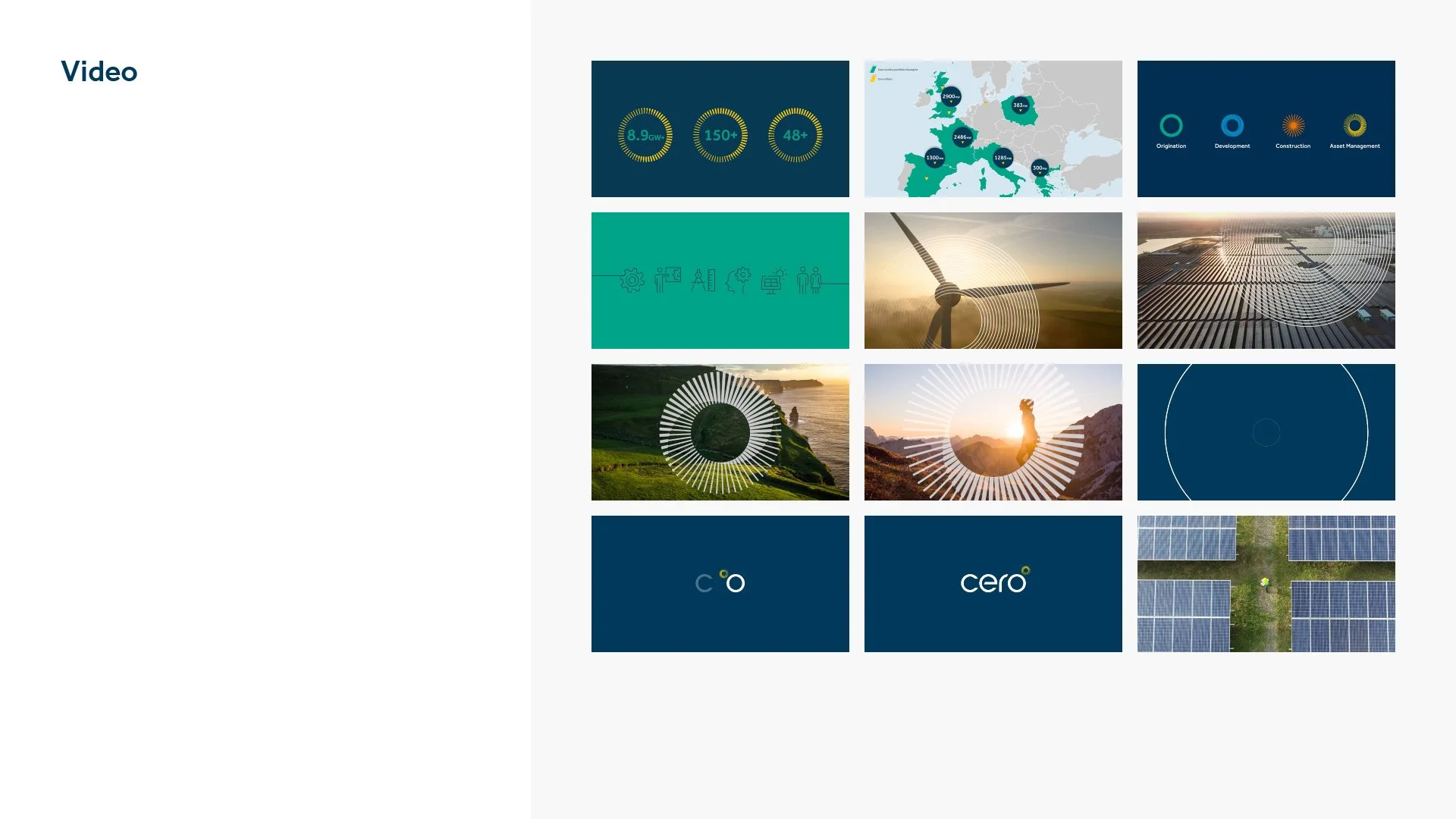
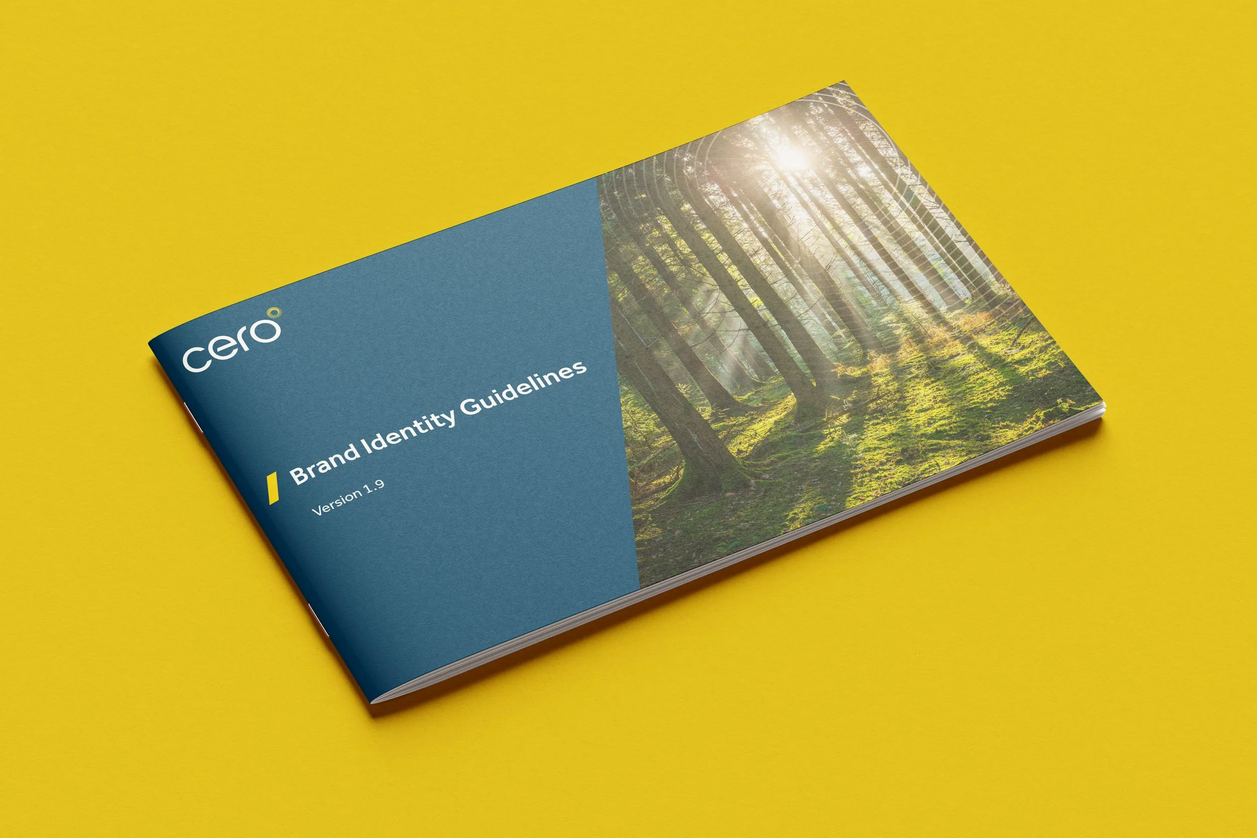
Although Cero had some existing branding it wasn’t implemented consistently and the team weren’t particularly keen on the original bright brand colours and required something more sophisticated. Utilising the axial tilt that featured in the logo mark, I incorporated the 23° angle into their branding, providing a sense of forward drive and momentum. The design also moved away from the use of generic solar panels photography towards imagery that spoke of the purpose and sustainability aspirations of the company. I prepared an updated brand guidelines document to guide all future material.