The Guardian
Digital, UX Design
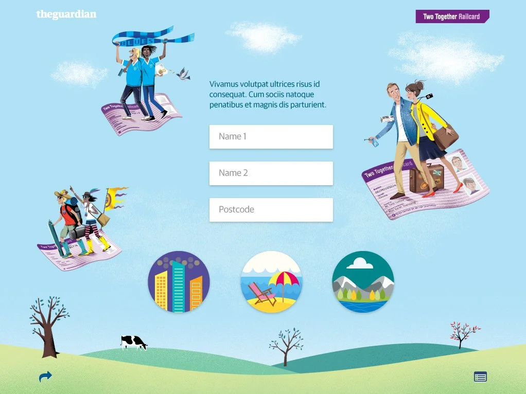
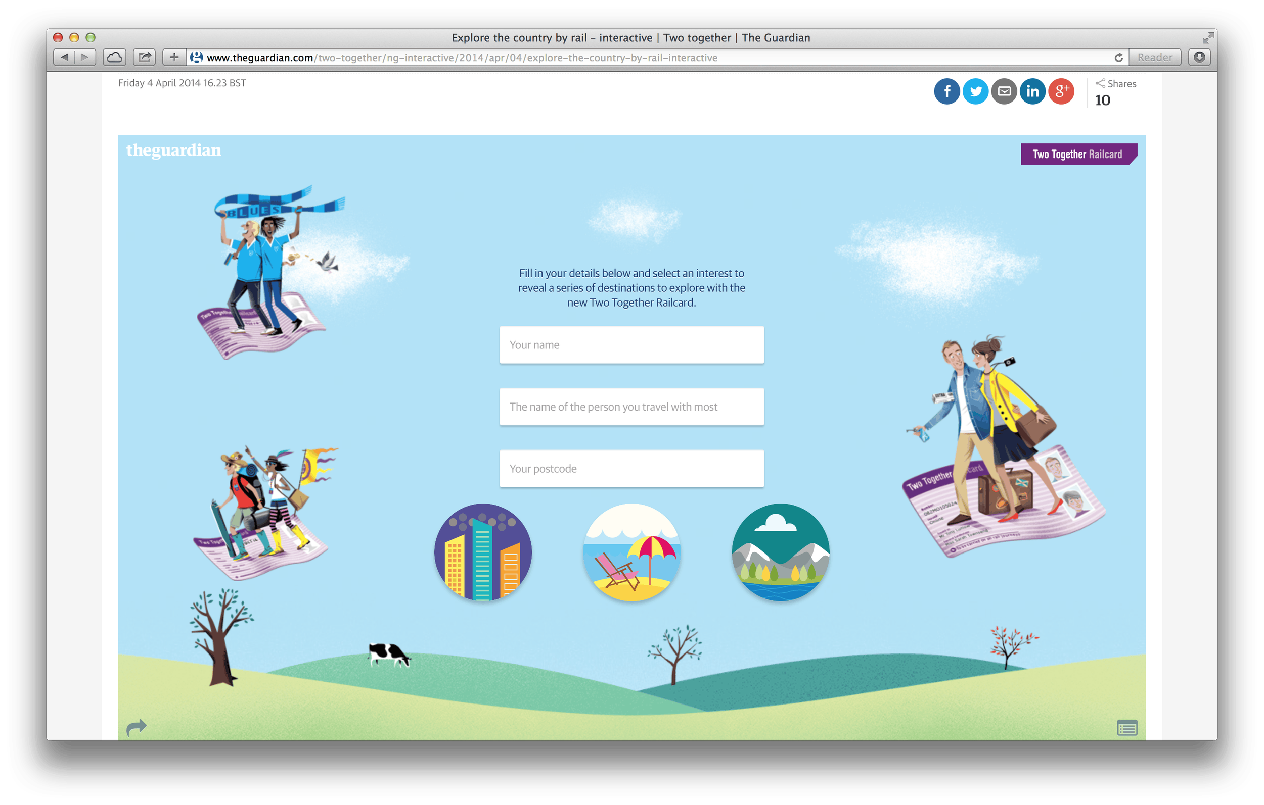
The Guardian required a captivating interactive for the Two Together Railcard to be used on their site, after partnering with ATOC to promote the card. Core to the brief was the creation of an app which allowed users to look at the significant savings they would make for various journeys with the card. Following the recent redesign of The Guardian’s website, the app also needed to be responsive to allow people on both mobiles and tablets the ability to use the same features.
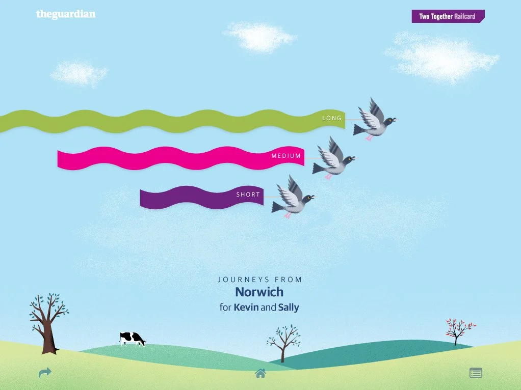
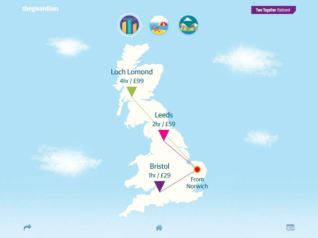
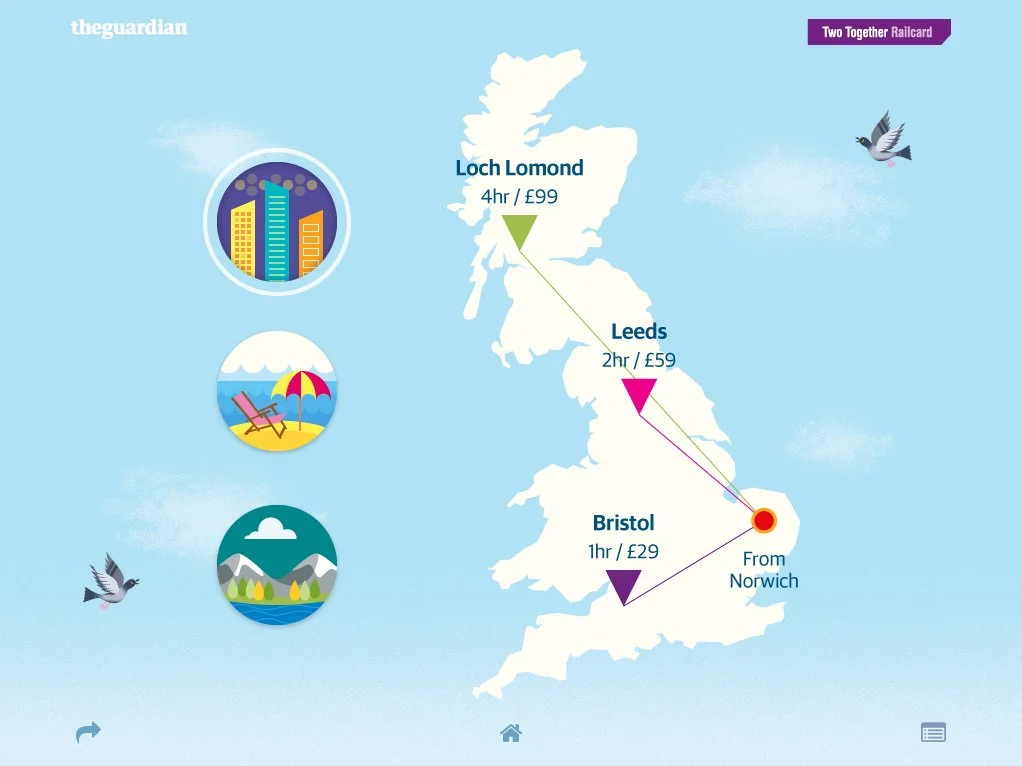
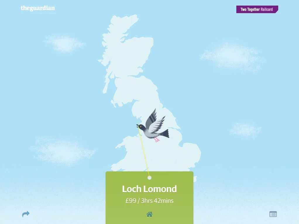
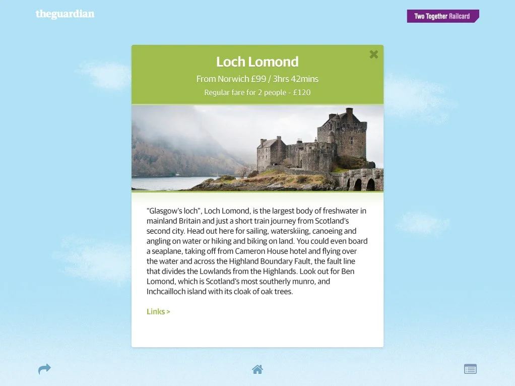
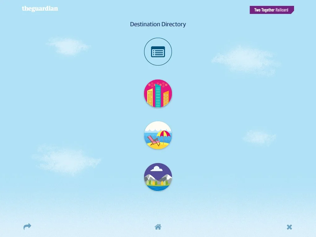
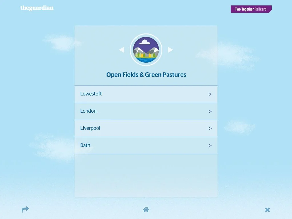
Using the illustrations of Ben Kirchner as a starting point, I created a mini UK for users to ‘fly around’ and learn a little bit about the destinations they could visit, whilst also seeing how much the card would save on fares. After the user supplys their postcode, a map of the UK appears to display three journey types - short, medium and long - from the user’s nearest train station.
The Guardian
Two Together Railcard Microsite.